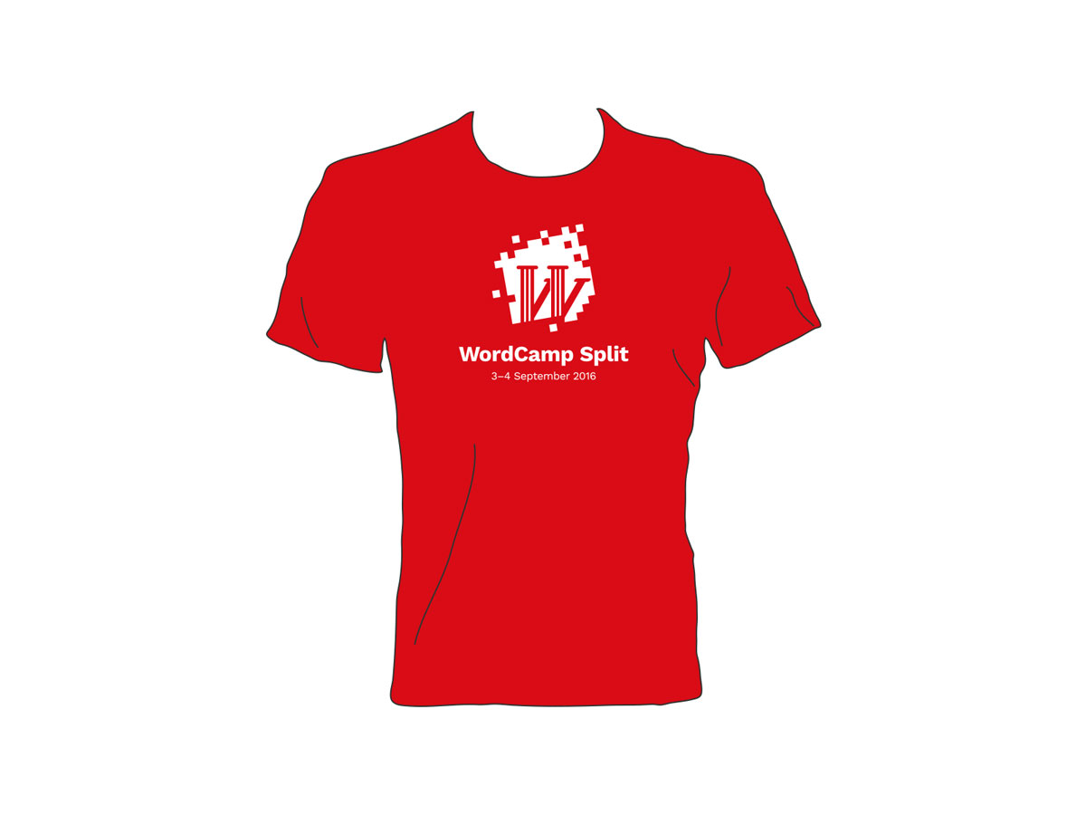
Our last WordCamp Croatia was held in Rijeka and Split will host it this year. Next year? Who knows. As every location is unique, branding is the perfect opportunity to highlight that location. And with changing the WordCamp location each year, we wanted to develop something new that could be (at least in some form) be used over years to represent that. We present you the new visual identity for Croatian WordCamps that will be used for the first time at WordCamp Split.
The logo consists of two important elements – an outer mask and a symbol on it. Outer mask is formed as a simplified checkerboard, which is also a base of Croatian national coat of arms. In the world, these squares are a symbol that a lot of people associate with Croatia so we wanted to use it as a base for our logo.
While the mask will stay the same for every Croatian WordCamp, the unique element inside that mask is location specific. For WordCamp Split, we decided to imitate the famous WordPress “W” symbol by using styled pillars that cast a shadow and thus form the W-shape. These antique roman pillars are often seen in Split, whether you are visiting the beautiful Diocletian Palace, Peristil or some other antique site.
We hope you’ll like the branding and wear T-Shirts featuring WordCamp Split logo with pride.